The Concept
StarPay is a dark, minimal fintech app concept designed around one core idea — financial discipline as a lifestyle. Not just another payments app. A system that analyses your earnings, understands your goals, and builds a strict, personalised plan to get you there through structured budgeting, savings targets and controlled spending.
Most financial apps tell you what you've already spent. StarPay tells you what you need to do next. The distinction is the entire product.
Why StarPay Exists
Most people know they should save more. Most budgeting apps confirm that they aren't. What's missing is the gap between awareness and action — a system that doesn't just show you the problem but actively builds the solution around your specific income, goals and lifestyle.
StarPay was designed to close that gap. By combining earnings analysis, goal setting and automated plan generation into one dark, premium interface, it makes financial discipline feel less like restriction and more like direction.
"Most financial apps tell you what you've already spent. StarPay tells you what to do next — a strict, personalised plan built around your income and your goals."
Visual Language
The visual direction was deliberately dark and minimal — financial tools carry weight and trust, and the aesthetic needed to reflect that. No playful colours. No cartoon illustrations. A restrained palette, precise typography, and enough negative space to let the data breathe.
The dark interface also serves a functional purpose — financial information is sensitive, and a dark UI creates an instinctive sense of privacy and seriousness that lighter interfaces don't.
Four Screens. One System.
Four key screens were designed to map the complete user journey — from onboarding through to daily use.
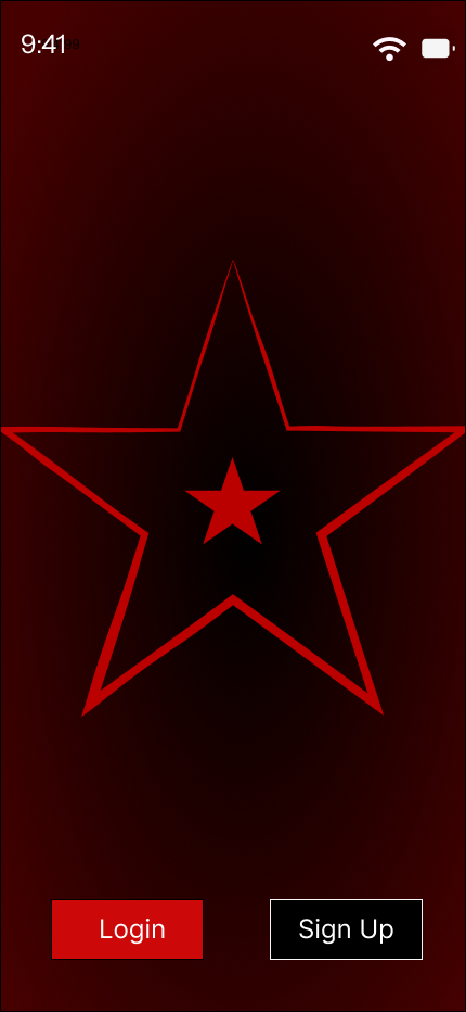
Login — the Entrypoint. Simple and direct, aimed to introduce consumer to the world of Starpay .
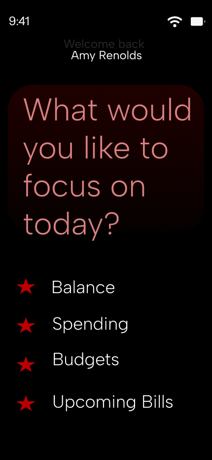
Questionnaire — the onboarding intelligence. StarPay asks the right questions — income, fixed expenses, financial goals, timeline — before it builds anything. The plan is only as good as the information it's built on.
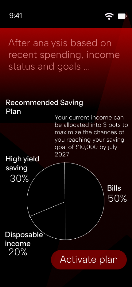
Analysis — the engine. Where StarPay processes the questionnaire data and presents the user's personalised financial plan — broken into savings targets, spending limits and payment schedules.
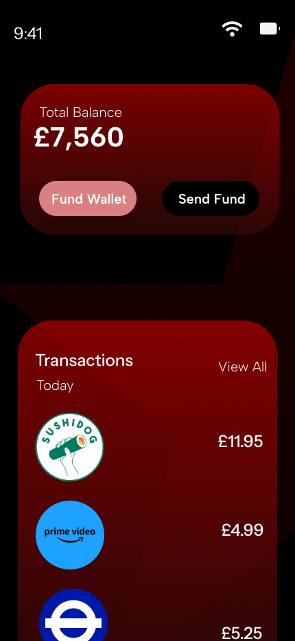
Transactions — the record. A clean, chronological view of every payment, categorised and tracked against the plan. Not just what happened — whether it was on plan or off it.
Designed in Figma
The entire project was designed in Figma — from initial wireframes through to the final high fidelity screens. Components, auto layout and design tokens were used throughout to maintain consistency across all four screens and allow for easy iteration.
The focus was always on the user's relationship with their money — making complex financial data feel accessible, actionable and under control. Every design decision was made in service of that feeling.
What Was Designed
Home Screen
Dashboard with balance, savings and spending overview
Questionnaire
Onboarding flow to capture financial goals and income
Analysis
Personalised financial plan generation screen
Transactions
Categorised payment history tracked against the plan
View the full design
Explore all four screens, components and design decisions in Figma.
View on Figma